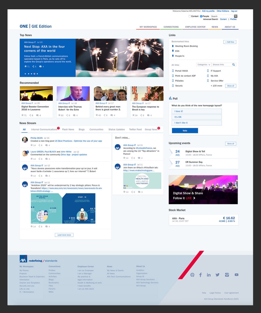
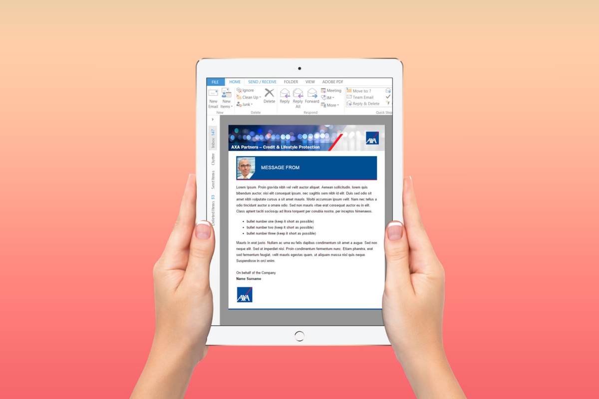
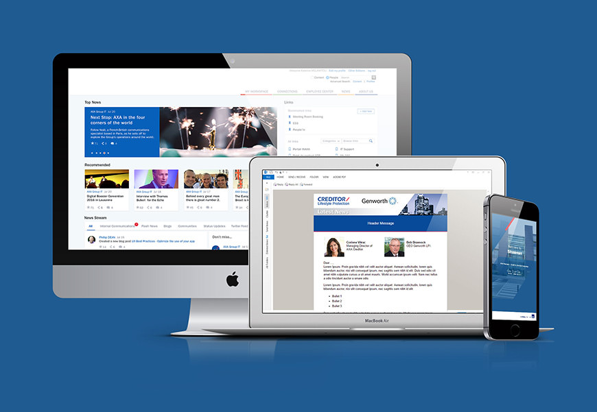
AXA acquired Genworth Insurance and there was a need to expand, the current intranet and communication.The intranet is the company's main internal communications portal, this portal allow communications to be channelled from all regions within the company.
I was involved in the revamping of the Intranet, communication portal, to attain AXA/departmental goals, and to improve the User experience. In this case Users are company employees and employers.
At the beginning of 2016, I helped AXA insurance to redesign their intranet. Acting as their UX UI Designer.
My process included the following steps.
Research focused to understand, business and departmental goals, user needs and user behaviors, needs, and interviews, motivations through observation techniques, task analysis, and other feedback methodologies. For me user research is “the process of understanding the impact of design on to the experience”.
The easiest way to understand behavior is through scenarios, identifying a users goals and needs and his following action steps will lead you to truly understanding why and how a user is using your product. That represent the building-block for the project development.
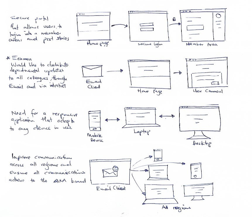
After guring out who the projects audience is I normally build the personas, This is similar to shaping a piece of clay. By doing this I’m creating a clear image of who the user in our audience is. The personas looked something like this:
After guring out who the projects audience is I normally build the personas, This is similar to shaping a piece of clay. By doing this I’m creating a clear image of who the user in our audience is.
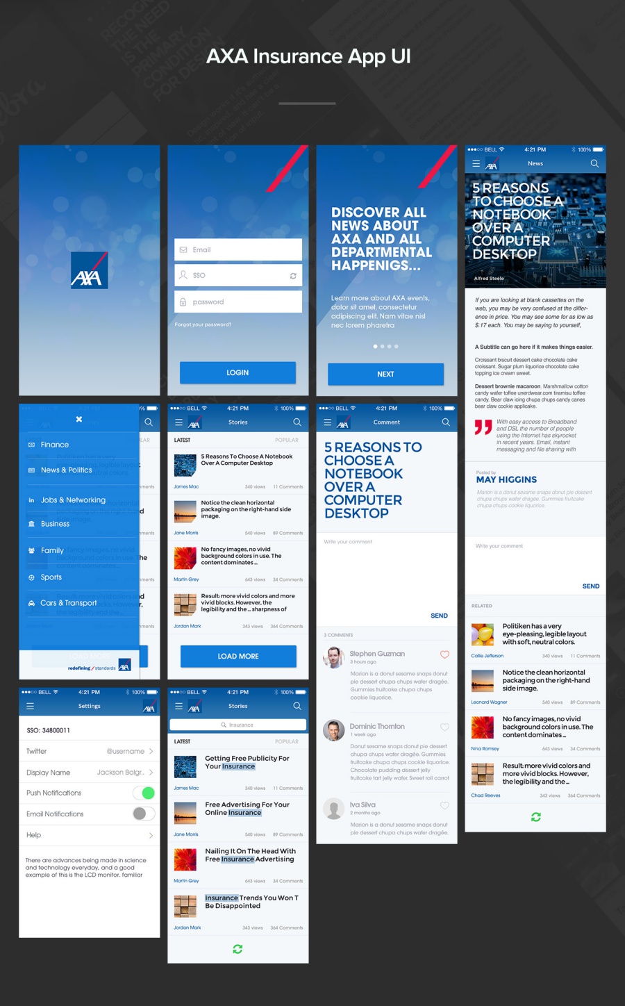
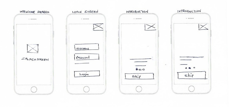
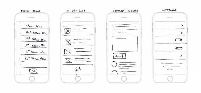
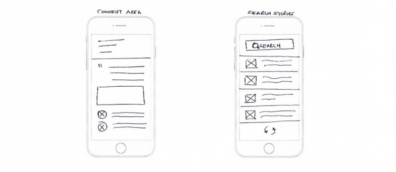
With the proper planning, I was able to confidently move into creating wireframes for the app. I took the decision to focus more on the functionality and structure of the app, opting for low-fidelity wireframes with very little detail. Ultimately, I could add design elements in later, what was important for the users, was that the product was clear and simple.
In order to make good decision about both design and implementation you need data about how people use designs, and the only way of gathering this data is through usability testing
| Before | After | |
|---|---|---|
| Privacy (secure login) | 0 | 5 |
| Discover news | 3 | 5 |
| Improve communication | 2 | 6 |
| Create stories | 1 | 4 |
| Improve the brand | 1 | 5 |
| Improve responsiveness | 1 | 4 |
| Improve user experience | 2 | 6 |
Visual design maximizes the aesthetic, information-conveying capabilities of graphics and text. It’s actually a subdiscipline within the UX process, contributing to UI Design, information design, and graphic design.
Metrics are the signals that show whether your UX strategy is working. Using metrics is key to tracking changes over time, benchmarking against iterations of your own site or application or those of competitors, and setting targets.